Tagged: Niepoort
Wine and Art meet on the wine Label and beyond .
Art on the Label
A wine Label is an “invention” of not much more than 120 hundred years. Although nowadays wine labels have turned into a “selling lever” of a wine, an eye catcher for the customer in a wine shop or on the wine shelve in a supermarket, the fly paper for the novice wine drinker, and thus have moved under the jurisdiction of advertizing companies PR advisers and graphic designers some of whom don’t even like wine!!!

Having said that, the wine label is still the ID of the wine and any wine bottle is “legally” required to carry this ID at all times! The basic function of the label is to provide the wine buyer with basic information regarding the product which is essentially a “food” or “beverage” product, which is bound by each country’s laws.


As any label on a food pack, it has a design which conforms to the legal requirements on one hand and to the owners taste on the other. There are “label artists” or “graphic designers” all over the world who produce such labels.
Wine has a long history, it was one of the first things that Man created, and had great effect on many cultures and their religious ceremonies. In ancient times the Egyptians the Greeks and Romans recorded the vintage, vineyard and winemaker on individual jars of wine which could be counted as the first wine labels.


“Gath Carmel” inscription on pottery wine jug 400BC Hoshea’s Temed Seal around 50 AD
The presumably Lafite 1787 belonging to Thomas Jefferson had the chateaux name and Vintage year and the initials ThJ for the “owner’s” name hand written directly on the glass with “glass paint” possibly by the Chateaux, so were other 19th century Vintages.


Wine bottles taken away from their region of origin were inscribed on with the wine’s name of producer and Vintage year to allow the buyer or his cellar master distinguish between the different wines in the large cellar of a palace, be it a kings or a Tsar palace (Russian rulers were known to be collectors of Tokaji), they maintained a detachment of Cossacks solely for the purpose of escorting convoys of the precious liquid from Hungary to the royal cellars at St Petersburg. Tokaji reputed to last at least 300 years, was considered a secret potion of eternal youth. From the days of Tsar Peter I, the Great (1672-1725) for more than 100 years the Romanov family accumulated bottles of Tokaji in their cellars, surely there was enough for everyone but again, someone had to be there to know who is who? At the zoo…Surely someone made sure he will be able to tell between bottles of different Vintage years.


Same goes to the Kings of England and their affinity and connection to Bordeaux, or the cellar collection of the Kings of France to name but a few.
Chateau Mouton Rothschild
 Until 1924 most wine producers were busy working at the vineyard and at the winery making wine in barrels, that they sold the wines bulk in the barrel or casks to wine-merchants, who then were responsible for the “faith” of the wine. Decisions of how to treat the wine in the barrels were out of the producer’s hands. The bottling process was done by wine merchants who labeled the wine under mixed names of chateau and vintage and their own name. The winery had no say over the finished product and had no real interest on the appearance of the bottle or the label.
All of this was going to change when in 1924 Baron Philippe de Rothschild decided to bottle the entire harvest before it left the winery (MIS EN BOUTEILLE AU CAHATEAU / DOMAINE.) . This decision changed the wine world completely and gave the Chateaux/winery, complete control over their product and its final quality. By adding their own label on their wine as a trademark stamp of quality boast: “This is our wine and we stand behind it and its quality under our name and reputation”. A logo to reflect the winery as an individual, to separate “our” wine from others, that bore the first logo as we know it today, and to commemorate this “cry for independence”.

The Logo was ordered from the famous poster artist Jean Carlu, who designed a logo that was used for the 1924 Vintage. The result was a stunning cubist design, which is considered till today as the most successful example of contemporary art influence on a commercial package design.
The basic theme of the 1924 poster was turned into a “family crest” stile logo; the label carried the Bottle number in that vintage year and the chateau name: Mouton Rothschild… All until the legendry 1945 Vintage not only it came at the end of the bloodiest war mankind ever knew but considered to be amongst the 20th century 5 top vintages the fact that it was the victory vintage, following World War II only added to its legendary status.

They say that everything went down just right for the 1945 Bordeaux wines. The winter freeze helped reduce yields, which added immense concentration to the wine. Growing conditions were perfect from start to finish. Harvest, under draught like conditions caused even lower yields and highly concentrated berries, an early harvest, which started on September 13. Massive extraction of tannin meant longevity and long developing period (decades). Due to this high tannin levels, many of the wines still show well today. Due to the ability of 1945 Bordeaux wine to age well some say a few of them will be drunk well by 2045 at 100years old…


Did Baron Philippe know this was going to be such a great wine, a wine to act as reference to all wine before and after it? When he decided to embellish the 1945 vintage label with an Art work to symbolize the return of peace on the land? Was it an art work? After all it was commissioned from a young unknown artist/designer Philippe Jullian. He utilized the V sign (for victory) amongst vine leaves a biblical symbol of peace: “And Judah and Israel dwelt safely, every man under his vine and under his fig-tree” 1Kings 4:25


The Labels that followed: The 1946 Vintage label, was commissioned to Jean Hugo (grandson of Victor, who also used a biblical symbol of peace the dove returning to the ark after the flood with an olive branch, commemorating the first year of peace. After that most artists commissioned where substantial figures in the art world of their era: Cocteau, Braque, Dali, Moore, Miro, Chagall, Picasso, Warhol, Herring and many more. Each year since 1945 a label had been adorned by an artist sometimes (by chance) reflecting the quality and character of the content THE WINE, or just as a continuing tradition of the reciprocation between two art forms complementing each other. The art of winemaking at its best hailed by top artists paying their respect to a consumable art form, when the bottle is empty all that is left is the carefully “decorated” bottle with its label.
Since the basic idea is already taken, some wineries opt for introduce their version of art on the label for various reason. One philanthropic reason: special edition to be sold and raise funds for a good cause, the other in an effort to express the wines character or the owner’s whim. (Both are legitimate)
Castel winery Haute Judee, Israel, one of the best boutique wineries in Israel, approached 13 Leading Israeli artists who volunteered to take part in a one off, label project: Arie Azene, Nissim Ben Aderet, Amnon David Ar, Yair Garbuz, Ori Gersht, Menashe Kadishman, Michel Kichka, Ofer Lellouche, Philip Rantzer, Jan Rauchwerger, Gideon Rubin, Eran Shakin, & Yigal Tumarkin, to prepare or choose from their work of art to appear on the Castel Grand Vin 2009 in bottle, magnum and double magnum formats to be sold at auction to the highest bidder. The choice of artists was careful amongst the elite local artists. The benefit will go to the “Threefold Cord” – a non-profit organization which cares for at-risk youth in Jerusalem.
The entire collection of the works of art, labels can be viewed at: http://castelartandwine.com/products/?cat=35


This is Art on a label for a specific reason it is a one off limited edition, for a worthy cause, All commendations are due to the Ben-Zaken family (owners and winemakers of Castel winery), and the artists who donated from their collection a piece of art suitable for the occasion. Most of the above artists believe that producing an Art piece especially for a label is not the idea, and happily contribute a piece of their choice or part of an existing painting.

The wine: Castel Grand Vin 2009 , The wine has a deep purple color with strong aromas of black and red berries with a touch of ripe fig and Violets, flavours of ripe Blackcurrants & raspberries with a touch of sweet vanilla and hints of mint. The fruit is full and robust and very well balanced with pleasant rounded rich tannins which give the wine elegant strength and presence to help keep the wine “alive and kicking for another 6-10 years, the velvety touch and approachability on the palate make it a seductive wine and a very good choice for this limited edition. Not that I think it is of great importance (certainly a source of pride for the winery) the Castel Grand Vin 2009 received 92 points from the Wine Advocate annual 2011 tasting of Israeli wines.
More specifically about Castel winery and their wines on a separate post soon…
NIEPOORT
In 2004 Dirk Niepoort and his designer Cordula Allesandri decided to produce an label more suitable and appealing for the German wine buyer with the aim to introduce Portuguese, Douro wines in closer touch to the German wine consumer. Wilhem Busch storyboard label and the name FABELHAFT was the result. Following this trial, Niepoort began to develop different labels suitable to specific countries i.e.: Portugal (Diálogo), Norway (Fabelaktig), Finland (Sarvet), Allez Santé (Belgium), ETO CARTA (Japan), Fantasi (Denmark), Drink Me (UK), Twisted (USA), Berek (Poland), Gestolen Fiets (Holand), OO JA PAEV( Estonia), Ubuntu (South Africa), Sasta (Ireland), Conversa (Brazil).


On top of all the difficulties, the Niepoort tem report that “it turned to be a rewarding project for Niepoort and costumers alike”. The use of wine labels in this case was aimed to reflect the quality and character of their wine in a creative approach involving winemakers and artists. It is also a sort of homage to the Douro region, with its magnificent panoramas of rugged nature, the steep vineyard slopes, the flow of the Douro River and its tributaries, the narrow valleys and the local extreme climate, as well as the difficult conditions for producing wine when using the artisanal processes that make this region so special. (from Niepoort site: http://www.niepoort-vinhos.com/en/fabulous/)

Here the label is an effort to bridge a gap between the wine maker, his locality and aspirations, the character of the wine, and the consumer via an object which is consumed visually at first before the bottle is opened and thus forming an aesthetic dialogue between the label and the wine.
There are 3 groups of Labels :
The first: “Niepoort’s Soul”, reflecting the “magic of the Douro region through images of the estates and the winery”.
The second group: “Projects”, is more “experimentalist” in nature.
The third group: “Fabulous”, tries to emphasis the artistic excellence of the labels. Judge for yourself at : http://www.niepoort-vinhos.com/en/fabulous/


There is no doubt that wine at its best is a work of ART, does not use fixated idea of an effort to “reach” a certain taste and smell, but a proper use of the product at hand : Use of a given vintage, qualities and character, add a bit of their own geography, geology and climate terroir in short, and turn it into a beverage that is not meant to quench thirst but rather an intellectual sensual travel into the layers of wine and mind from the perspective of all 5 senses: sight, smell, taste, touch and sound. Just like a good piece of Art is the use of paints and colors on paper or canvas that transcends into an object that evokes emotions. In this sense good art and good wine go comfortably hand in hand together, and wine drinkers /appreciators, get to enjoy the finished product.
Your Wineguide
The magnificence of the Douro A Visit to Niepoort
This is our first visit to Portugal, though my love of Port (the wine), always allured me to this lovely country it is only now the opportunity of a short visit came about…
The Romans arrived here a long time before me, around the 2nd Century A.D., conquering the Celtic inhabitants and establishing cities like Conimbrigia Setúbal, Aveiro, Obidos and Lamego to name but a few. The Romans brought wine and vines with them, and are responsible for introducing some eastern Mediterranean grape Varieties such as Muscatel Graudo, to the Iberian Peninsula. Its distinctive aroma is quite easy to recognize being one of the few grapes whose wine smells like the fresh grapes, plus scents of young raisins, lemons, tropical fruits, lime and citrus bloom. It has good, fresh acidity. Elsewhere in the world, it is known as Muscat of Alexandria, mainly used for sweet, fortified wines, most famous of which is Moscatel de Setúbal with its firm aromas of acacia blossom.


It is mid April and the fields are flowering with some wild flowers (it hardly rained this year in the Cima Corgo region, but this is an arid piece of land in European standards, still the vines are used to water shortage and hardship, and the vintners, as always complain about the weather…
We are leaving ancient Conimrigia, the largest Roman settlement in Portugal. Driving due north and entered through the “gate” to the Northern wine regions of Portugal, via Lamego the small town with the monumental baroque Sanctuary of Nossa Senhora dos Remédios.

 A marvelous granite staircase decorated with tiles, allegorical fountains, small chapels, and statues which lead to a baroque church up the hill. What a wonderful sight, with views all over the town.
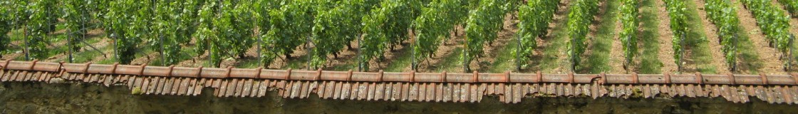
Next stop Pinhão in the Cima Corgo, one of the three sub regions that form the Duoro wine region. Cima Corgo – Located further upstream from the Baixo Corgo in the west, centered on the town of Pinhão (municipality of Alijó). The rainfall is about 600 mm a year. We’re heading towards the centre of the meticulously terraced Duoro Valley, enjoying the magnificent view of this spectacle: The oldest legally defined (AOC), wine-producing region of the world!


As a local saying goes, “God created the Earth and man created the Douro”, with its dramatic landscapes on the steep banks of the river created over centuries of human cultivation, made up of carefully terraced vineyards of the home of port wine. the Douro Valley is breathtaking with its hills covered with terraces of vines falling down steeply all the way to the river banks. The Douro River originates in Spain and flows west in the north of Portugal until it reaches the ocean in the town of Porto.

Today we enjoy the view and some wine and Port from various producers, and a good rest in The splendid C S VINTAGE HOUSE HOTEL, on the river bank in Pinhão, tomorrow we are invited to a visit at Quinta de Nápoles Just outside the town of Pinhão. It is one of Niepoort’s acquisitions of own vineyards, with wineries adjacent to them.


We cross the river to the north bank. The winery building designed by Austrian architect Andreas Burghardt, is camouflaged in the terraced hillside. Grapes travel a short ride from the vineyards to the reception area, which is the “roof” of the winery, and from there brought down the four floors of the building. Everything is there from the clusters stage start to the finished wine stage in the basement. It seems to fulfill Dirk Niepoort’s wine making philosophy. It enables a close watch on quality control of the wine, on the wine drop level, rather than the bulk Juice that starts in the “lagares”. (A lagare is the traditional container made of granite or cement where grapes are foot pressed for juice extraction).


As our hosts Gabriela Santos and Carlos Raposo emphasized, that owning Quintas and vineyards in the Douro was an important step in the continuation of the port wine tradition and the first step for the creation of Niepoort table/dry wines. Niepoort is now at the top of Douro winemaking, I guess this is because he originates from the love of excellent wine in general, placing him amongst the leaders of the new generation of quality winemakers who combine the best of both the world, that of 350 years old local tradition with a desire to produce world class wines. Some of which we will taste shortly from the barrels and from the bottled past vintages.
Till today Niepoort, was in my mind, the winery that produces the best Colheita Ports and as it turned out it produces serious and sophisticated dry red and white table wines.
I will not bore you with the laborious job of barrel tasting we did in the barrel cellars, some of which were absolutely surprising to me as a novice to those Portuguese grape Varieties for whites: Rabigato, Codega do Larinho, Arinto, Gouveio and Viosinho, for reds: Tinta Amarela, Touriga Franca and Nacional, Tinta Roriz, Tinto Cão, and several others. The region’s geology of mica slate and schist’s soils of the region, the usually harsh climate and the fact that most wines are made from old age vines 60-100 years old and that all wines are blends.
Here is where the secret lies, and the Art shows. Lead by the winemaker at Quinta do Nápoles Luis Seabra. The aim is for blended wines which sum up to much more than their separate parts, and it works!


Food is prepared with love and attention by the Quinta’s cook Maria José da Fonseca Mansilha. Who cooks and serves and over sees the lunch country style fare meticulously presented as you can see. With us set to the table Paulo Dinis Barreto the owner of EnoMania wine Distributor from the Isle of Madeira and his friend .
We start with Redoma Branco 2010 here you find an intense mineral flinty character, combined with the a touch of grapefruit bitter flavor with a sweet finish and added aroma of citrus blossom. A bit of smoky oak aroma, that does not mask the aromatic elements of the wine. A good crisp start
We move on to the more complex Coche 2010 a great wine with substantial character, Coche shows intense red grapefruit aroma with a touch of fresia floral notes with multiple layers of flinty mineral touch. A very long multilayered finish on the palate. A wonderful wine!
Than the reds come pouring in
First, the Vertente 2009. It has deep and cloudy purple color. Red and black fruit aromas, a touch of green pepper with mineral finish. Good balance, and elegant but powerful fruit with great freshness. The tannins are firm but not obtrusive. Will keep for another 5-6 years and even improve as the tannins round up.


Than came the Charme 2009 although quite Dark in color, the first thing that comes to mind when you sniff in the earthy mushroomy aroma is Bourgogne and it may well be what was on the blenders mind as the wine evolved. Even after 14 months in the barrels not every barrel is chosen to be bottled as Charme. There is an aim here and if not reached the wine will be used in other blends. The Charme 2009 is rich and elegant, with dark cherry, plums compote aromas, deep wet earth, mushrooms and a touch of truffles aroma engulfs the palate, the wine is totally hedonistic aimed at the pursuit of pleasure in the same manner a good Époisses de Bourgogne is. The finish is long with extremely good balance; tannins are well integrated and appear soft but will keep the wine for at least another 10 years. This was my favorite wine of our lunch/tasting.
But the most characteristic of the region in my mind is the Redoma Tinto 2009 Dark in color Mainly ripe black fruit aromas, with plenty of dark plums, a strong aroma of mint and thyme and of wet forest leaves. Flint stone touch and good tannic touch turning velvety well balanced with good acidity and fruitiness. The wine is very expressive almost extrovert, and rich, with very long and persistent finish. A wine true to its origin and Paulo’s favorite of the reds.
And to sum it all up, we had 2 Wonderful Ports

The Neipoort Vintage Port 2009 (Paulo’s preference for dessert).
The color is deep ruby blood red, and the aroma is all about sensuality, with freshly ground mixed sweet spices of cinnamon stick with cloves and English pepper with green cardamom. On the palate, amazing presence of huge tannins and high concentration of ripe re and black forest berries, very powerful but elegant, which is so well balanced that it seems it may keep forever (almost). I would buy a case to keep for my grandchildren and the generation to follow.
And the Neipoort 2001 Colheita (my choice for dessert).
Colheita’s are tawny Ports matured in wood for at least 7 years but most are taken even further before bottling. In Neipoort the grapes were trodden (by feet) in cast cement lagares and later the port is matured in small old oak casks. Colheita Ports are Tawny Ports from a single vintage year.
Wonderful brick reddish brown colour. It remindes the mysterious aromas of the spices street in an oriental souk. Scents of dried fruits, black shriveled grapes with burnet tea leaves, coffee and tobacco all with flavour of dried prunes and Figs in sweet liquor it has a long finish of soft and oily honeyed alcohol. A sip of that and with your eyes closed you can almost see shehrazad dancing in the palace of the Sultan. (Imagine what you see when you drink the 1900 or the 1970 Colheita! Alas we did not have that chance on the day. Maybe on our next visit)
We had the Ports with the amazing cheeses and Marias Orange cake.


And had to excuse ourselves we still had 2 hours drive to Porto and a fair amount of alcohol in our blood. Vilanova de Gaia looked a far reach But tomorrow we have a plane to catch to London where for ages these wines headed across the ocean and the English channel to it’s destination on the London Docks.
We parted our wonderful hosts sorry we were not staying in the region for at least another day with the magic taste of the Ports still lingering on our palates.
Adeus Porto hasta pronto.
P.S.
The Neipoort Iphone Ipad App is on : http://itunes.apple.com/en/app/niepoort/id517958040#
The wineguide
